刚坐在车里就开始电闪雷鸣。听着隆隆的雷声,没有恐慌,到有几分振奋人心的舒心感、酣畅淋漓感。朝外望去,突然间,狂风夹杂着骤雨席卷而来,一泻千里。瞬间暴雨如注,打在地上,溅起朵朵浪花,在热浪的蒸腾下激起层层水雾。满大街是慌乱的人群,行人跑着、叫喊着,唧唧喳喳的赶着在房檐下躲雨。这时候伞是没有用的,挡不住狂风暴雨的袭击,无论是带了伞的,还是没带伞的,全都躲在了房檐下。
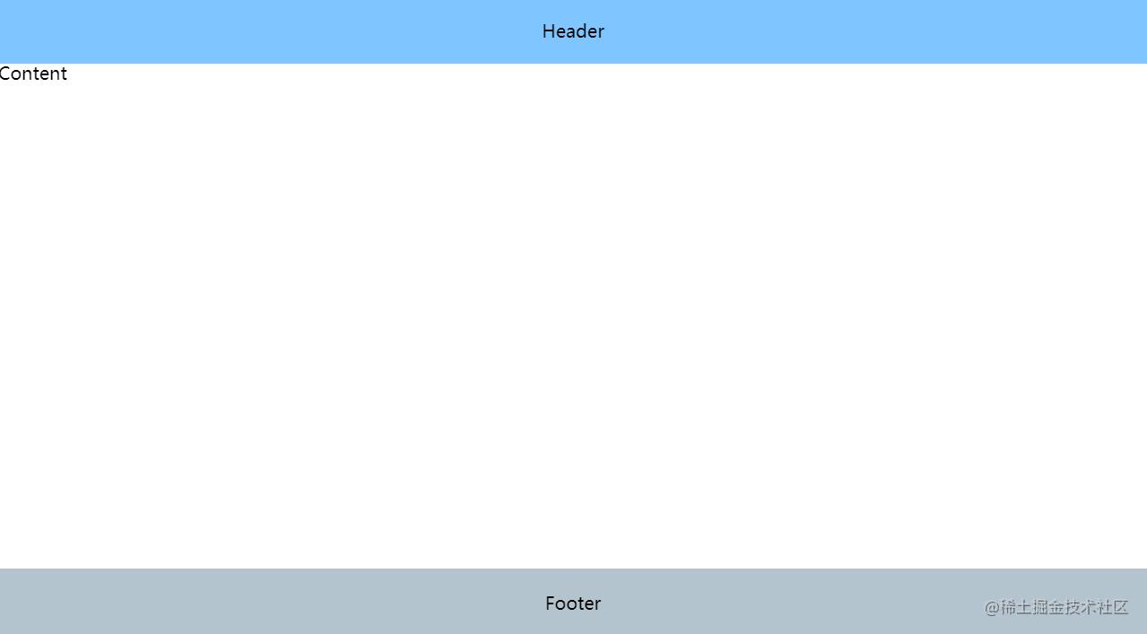
中间镂空的图片遮罩指的大概就是这样一个效果:
镂空一个洞的代码
CSS Code复制内容到剪贴板
- <divid="container"style="position:relative;margin:550px0050px;">
- <svgstyle="position:absolute;"width="400"height="280">
- <defs>
- <maskid="mask3">
- <rectx="0"y="0"width="100%"height="100%"style="stroke:none;fill:#ccc"></rect>
- <circleid="circle1"cx="100"cy="100"r="50"style="fill:#000"/>
- </mask>
- </defs>
- <rectx="0"y="0"width="100%"height="100%"style="stroke:none;fill:#ccc;mask:url(#mask3)"></rect>
- </svg>
- <imgsrc="http://img6.cache.netease.com/cnews/2014/11/3/20141103100737855b7.jpg"/>
- </div>
镂空多个洞的代码
CSS Code复制内容到剪贴板
- <divid="container"style="position:relative;">
- <svgstyle="position:absolute;"width="400"height="280">
- <defs>
- <maskid="mask3">
- <rectx="0"y="0"width="100%"height="100%"style="stroke:none;fill:#ccc"></rect>
- <circleid="circle1"cx="100"cy="50"r="50"style="fill:#000"/>
- <circleid="circle1"cx="300"cy="100"r="50"style="fill:#000"/>
- <circleid="circle1"cx="100"cy="200"r="50"style="fill:#000"/>
- </mask>
- </defs>
- <rectx="0"y="0"width="100%"height="100%"style="stroke:none;fill:#ccc;mask:url(#mask3)"></rect>
- </svg>
- <imgsrc="http://img6.cache.netease.com/cnews/2014/11/3/20141103100737855b7.jpg"/>
- </div>
CSS3 版
用 box-shadow ,代码如下:
CSS Code复制内容到剪贴板
- position:fixed;
- left:150px;
- top:35px;
- width:100px;
- height:100px;
- border-radius:100px;
- box-shadow:rgba(0,0,0,.8)0px0px0px2005px;
- z-index:100;
缺点是只能镂空一个洞。
到此这篇关于如何使用CSS如何实现中间镂空的图片遮罩效果就介绍到这了。无论你有多少朋友,不能少了书这个诤友。更多相关如何使用CSS如何实现中间镂空的图片遮罩效果内容请查看相关栏目,小编编辑不易,再次感谢大家的支持!

