效果演示
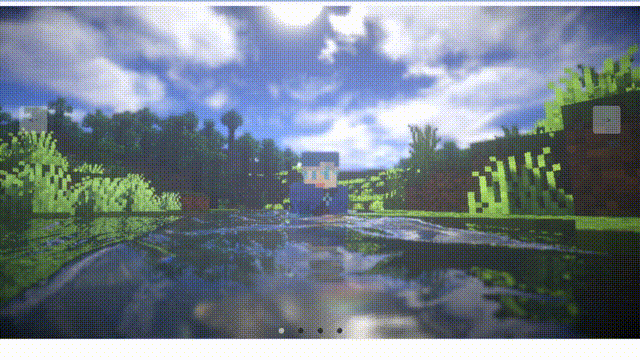
实现了一个简单的网页布局,其中包含了五个不同的盒子,每个盒子都有一个不同的背景图片,并且它们之间有一些间距。当鼠标悬停在某个盒子上时,它的背景图片会变暗,并且文字会变成白色。这些盒子和按钮都被放在一个容器中,整个页面看起来像一个画廊。
Code
<div class="container"> <div id="slide"> <div class="item" style="background-image:url('./img/章若楠01.jpg')"></div> <div class="item" style="background-image:url('./img/鞠婧祎01.jpg')"></div> <div class="item" style="background-image:url('./img/鞠婧祎02.jpg')"></div> <div class="item" style="background-image:url('./img/鞠婧祎06.jpg')"></div> <div class="item" style="background-image:url('./img/鞠婧祎04.jpg')"></div> <div class="item" style="background-image:url('./img/鞠婧祎07.jpg')"></div> </div> <div class="buttons"> <div class="left"> < Prev</div> <div class="center">下载壁纸</div> <div class="right">Next ></div> </div> </div></div>* { margin: 0; padding: 0; box-sizing: border-box;}.container { width: 100vw; height: 100vh; position: relative; overflow: hidden;}.item { width: 240px; height: 160px; position: absolute; top: 50%; left: 0; transform: translateY(-50%); border-radius: 10px; box-shadow: 0 30px 50px #505050; background-size: cover; background-position: center; transition: 1s;}.item:nth-child(1),.item:nth-child(2) { left: 0; top: 0; width: 100%; height: 100%; transform: translateY(0); box-shadow: none; border-radius: 0;}.item:nth-child(3) { left: 70%;}.item:nth-child(4) { left: calc(70% + 250px);}.item:nth-child(5) { left: calc(70% + 500px);}.item:nth-child(n+6) { left: calc(70% + 750px); opacity: 0;}.buttons { width: 100%; position: absolute; bottom: 50px; margin-left: -50px; text-align: center; display: flex; justify-content: center;}.buttons div { width: 120px; height: 50px; line-height: 50px; text-align: center; border-radius: 5px; margin: 0 25px; transition: .5s; cursor: pointer; user-select: none; font-size: 20px; color: #fff; background-color: rgba(0, 0, 0, 0.4); box-shadow: 2px 2px 2px rgba(0, 0, 0, 0.2);}const leftBtn = document.querySelector(".buttons .left")const rightBtn = document.querySelector(".buttons .right")const slide = document.querySelector("#slide")let openClick = true // 节流处理 (保证动画执行过程,按钮不被重复点击)leftBtn.addEventListener("click", () => { if (openClick) { openClick = false // 触发点击后,禁用按钮 const items = document.querySelectorAll(".item") slide.prepend(items[items.length - 1]) setTimeout(() => openClick = true, 1000) // 1s 再开放按钮的点击 }})rightBtn.addEventListener("click", () => { if (openClick) { openClick = false const items = document.querySelectorAll(".item") slide.appendChild(items[0]) setTimeout(() => openClick = true, 1000) }})实现思路拆分
* { margin: 0; padding: 0; box-sizing: border-box;}这段代码是设置全局的CSS样式,包括设置元素的盒模型为border-box,即盒模型的宽度和高度包括了元素的边框和内边距,而不是只包括元素的内容。
.container { width: 100vw; height: 100vh; position: relative; overflow: hidden;}这段代码是设置容器的CSS样式,包括设置容器的宽度和高度为100vw和100vh,即视口的宽度和高度。同时,设置容器的定位为相对定位,即相对于其父元素进行定位。最后,设置容器的溢出属性为隐藏,即超出容器范围的元素不会被显示出来。
.item { width: 240px; height: 160px; position: absolute; top: 50%; left: 0; transform: translateY(-50%); border-radius: 10px; box-shadow: 0 30px 50px #505050; background-size: cover; background-position: center; transition: 1s;}这段代码是设置盒子的CSS样式,包括设置盒子的宽度和高度为240px和160px,即盒子的大小。同时,设置盒子的定位为绝对定位,即相对于其父元素进行定位。最后,设置盒子的边框半径为10px,即盒子的圆角。盒子的背景图片大小为cover,即覆盖整个盒子。背景图片的位置为居中对齐。最后,设置盒子的过渡效果为1秒,即过渡效果的时间为1秒。
.item:nth-child(1),.item:nth-child(2) { left: 0; top: 0; width: 100%; height: 100%; transform: translateY(0); box-shadow: none; border-radius: 0;}这段代码是设置第一个和第二个盒子的CSS样式,包括将它们的位置设置为0,即它们覆盖在容器的最上层。同时,将它们的高度设置为100%,即它们覆盖在容器的整个高度。最后,将它们的变换属性设置为 translateY(0),即它们不会向下移动。同时,将它们的阴影和边框半径设置为0,即它们没有阴影和边框。
.item:nth-child(3) { left: 70%;}这段代码是设置第三个盒子的CSS样式,包括将它的位置设置为距离容器左侧70%的位置。
.item:nth-child(4) { left: calc(70% + 250px);}这段代码是设置第四个盒子的CSS样式,包括将它的位置设置为距离第三个盒子右侧250px的位置。
.item:nth-child(5) { left: calc(70% + 500px);}这段代码是设置第五个盒子的CSS样式,包括将它的位置设置为距离第三个盒子右侧500px的位置。
.item:nth-child(n+6) { left: calc(70% + 750px); opacity: 0;}这段代码是设置所有盒子的CSS样式,包括将它们的位置设置为距离第三个盒子右侧750px的位置。同时,将它们的不透明度设置为0,即它们不可见。
.buttons { width: 100%; position: absolute; bottom: 50px; margin-left: -50px; text-align: center; display: flex; justify-content: center;}这段代码是设置按钮的CSS样式,包括设置按钮的宽度为100%,即按钮的大小与容器相同。同时,将按钮的位置设置为距离容器底部50px的位置。最后,将按钮的对齐方式设置为居中对齐,即按钮在水平方向上居中对齐。
.buttons div { width: 120px; height: 50px; line-height: 50px; text-align: center; border-radius: 5px; margin: 0 25px; transition:.5s; cursor: pointer; user-select: none; font-size: 20px; color: #fff; background-color: rgba(0, 0, 0, 0.4); box-shadow: 2px 2px 2px rgba(0, 0, 0, 0.2);}这段代码是设置按钮的CSS样式,包括设置按钮的宽度为120px,高度为50px,即按钮的大小。同时,设置按钮的行高为50px,即按钮的高度。按钮的文本对齐方式为居中对齐,即文本在水平方向上居中对齐。按钮的边框半径为5px,即按钮的圆角。按钮的外边距为0 25px,即按钮在水平方向上左右两侧的距离为25px。按钮的过渡效果为0.5秒,即过渡效果的时间为0.5秒。按钮的光标属性为pointer,即鼠标悬停在按钮上时,鼠标的形状会变成手型。按钮的用户选择属性为none,即用户不能选中按钮中的文本。按钮的字体大小为20px,即按钮的文本大小。按钮的文本颜色为白色,即按钮的文本颜色。按钮的背景颜色为rgba(0, 0, 0, 0.4),即按钮的背景颜色为黑色,透明度为0.4。按钮的阴影属性为2px 2px 2px rgba(0, 0, 0, 0.2),即按钮的阴影为2px 2px 2px黑色,透明度为0.2。
到此这篇关于HTML+CSS实现全景轮播的示例代码的文章就介绍到这了,更多相关HTML CSS全景轮播内容请搜索好代码网以前的文章或继续浏览下面的相关文章,希望大家以后多多支持好代码网!