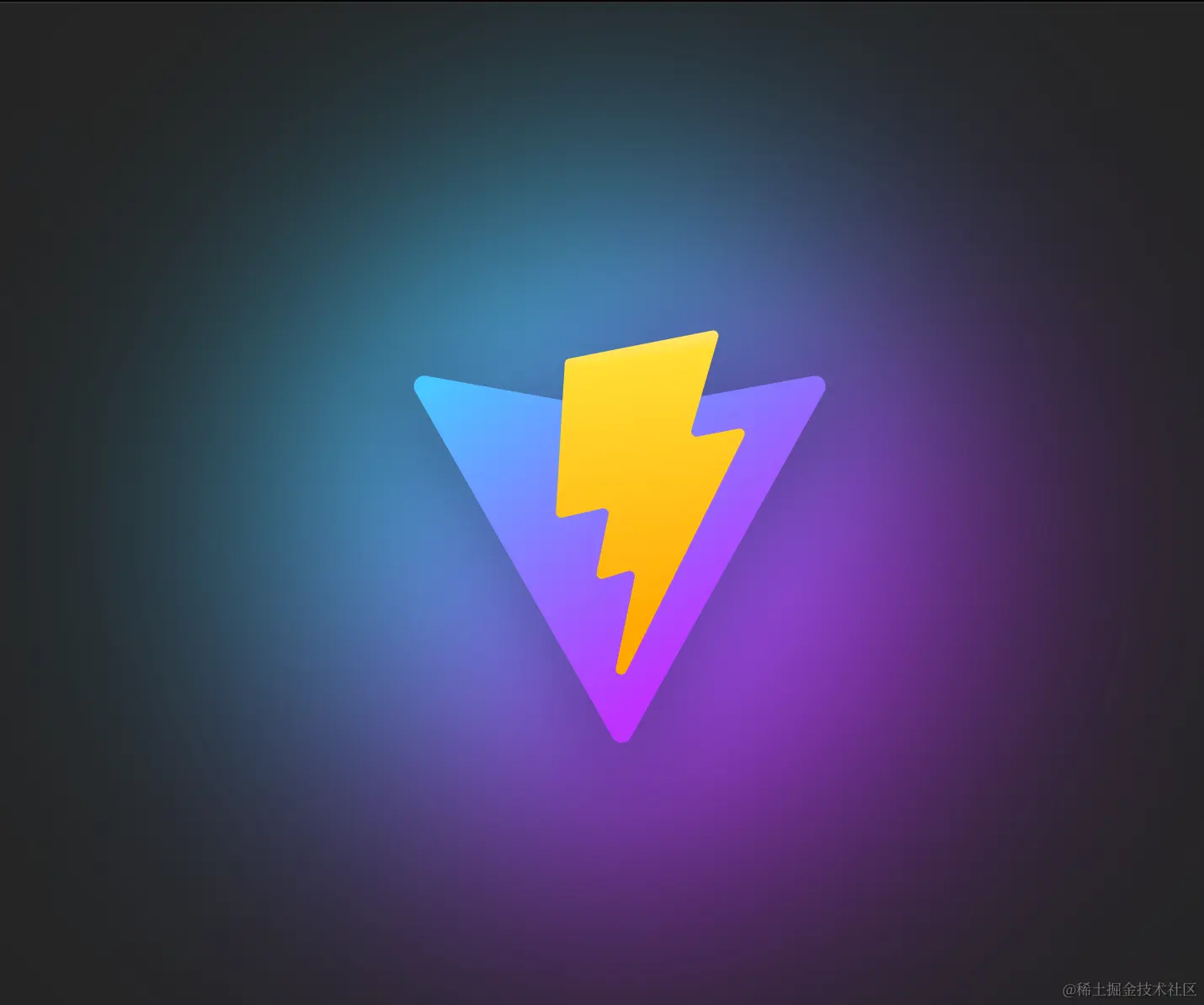
实现效果在线演示
实现
HTML 元素:
实现效果
实现
HTML 元素:
<figure>
  <section class="img-bg"></section>
  <img height="320" width="320" src="https://vitejs.dev/logo-with-shadow.png" alt="Vite Logo" />
</figure>
CSS 样式代码:
.img-bg {
  position: absolute;
  background-image: linear-gradient(-45deg, #bd34fe 50%, #47caff 50%);
  border-radius: 50%;
  filter: blur(72px);
  z-index: -1;
  animation: pulse 4s cubic-bezier(0, 0, 0, 0.5) infinite;
}
@keyframes pulse {
  50% {
    transform: scale(1.5);
  }
}
1. 增加背景
background-image: linear-gradient(-45deg, #bd34fe 50%, #47caff 50%);
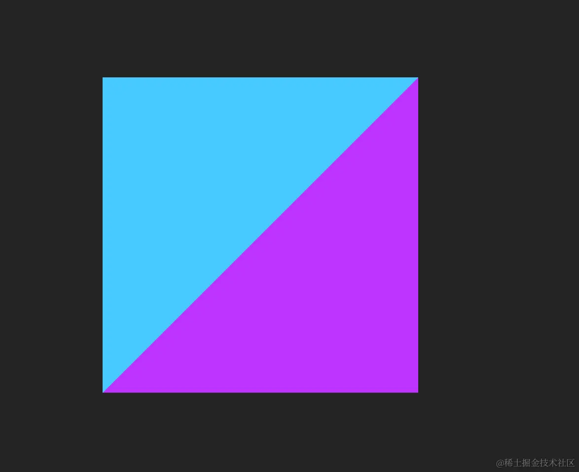
2. 将背景设置为圆形
border-radius: 50%;

3. 加入关键的filter 属性将模糊的图形效果应用于元素
filter: blur(72px);
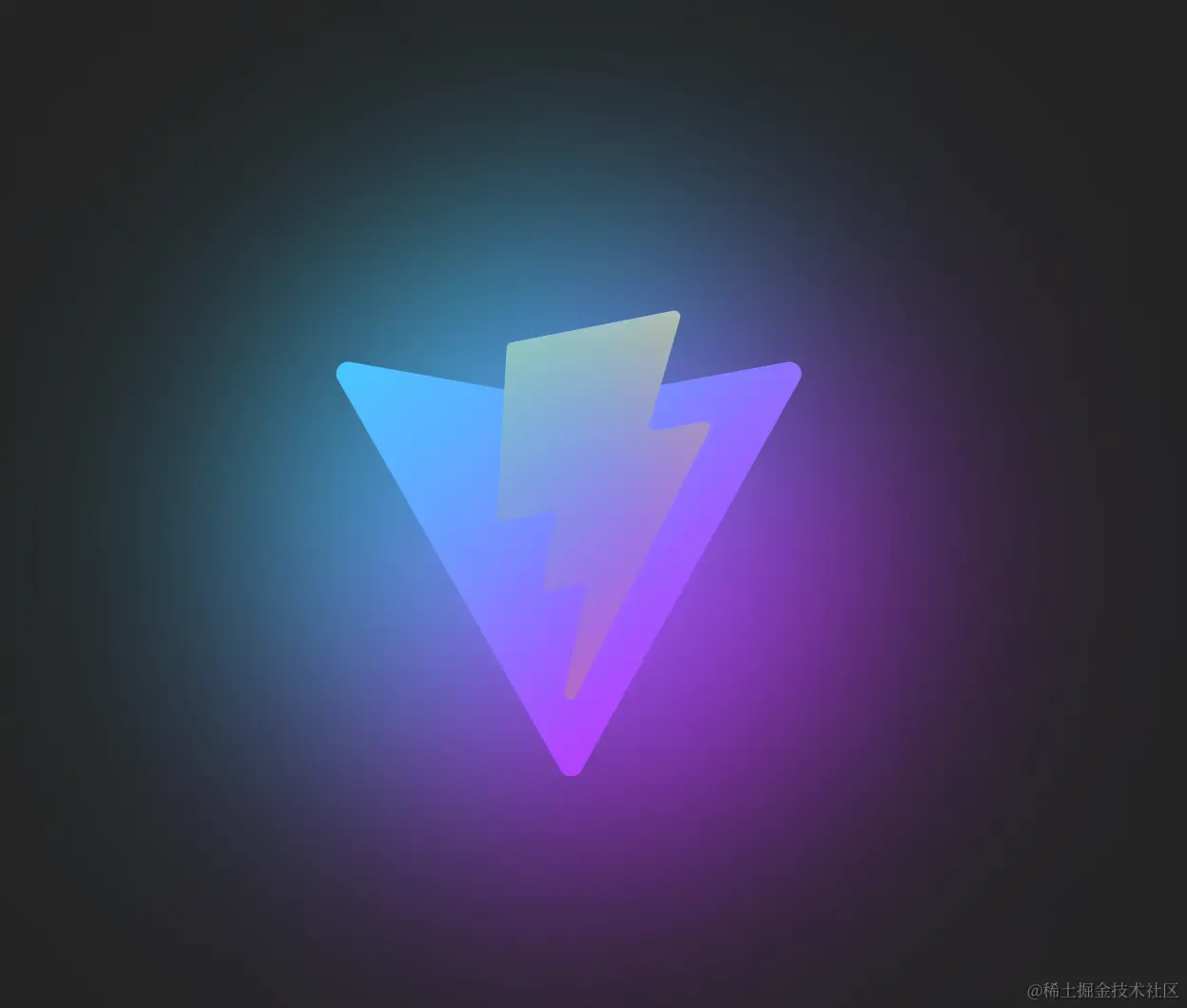
4. 将背景至于图形底部
z-index: -1;

5. 加入动画效果
animation: pulse 4s cubic-bezier(0, 0, 0, 0.5) infinite;
参考链接
以上就是使用CSS实现Logo阴影特效的详细内容,更多关于CSS实现Logo阴影特效的资料请关注好代码网其它相关文章!
