本文在 http://www.cookbook-r.com/Graphs/Scatterplots_(ggplot2)/ 的基础上加入了自己的理解
图例用来解释图中的各种含义,比如颜色,形状,大小等等, 在ggplot2中aes中的参数(x, y 除外)基本都会生成图例来解释图形, 比如 fill, colour, linetype, shape.
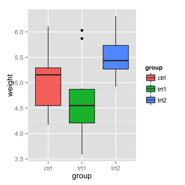
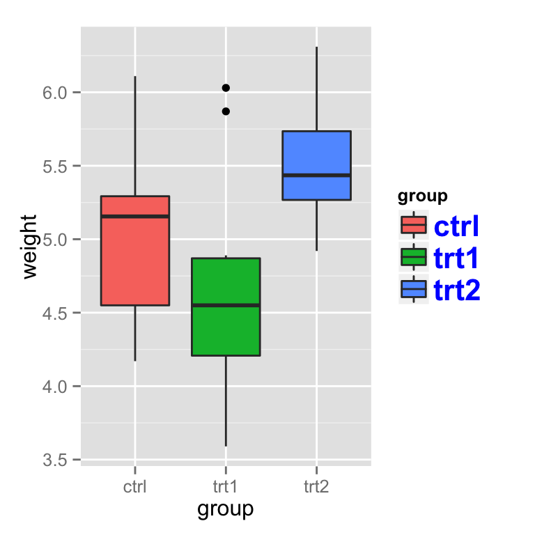
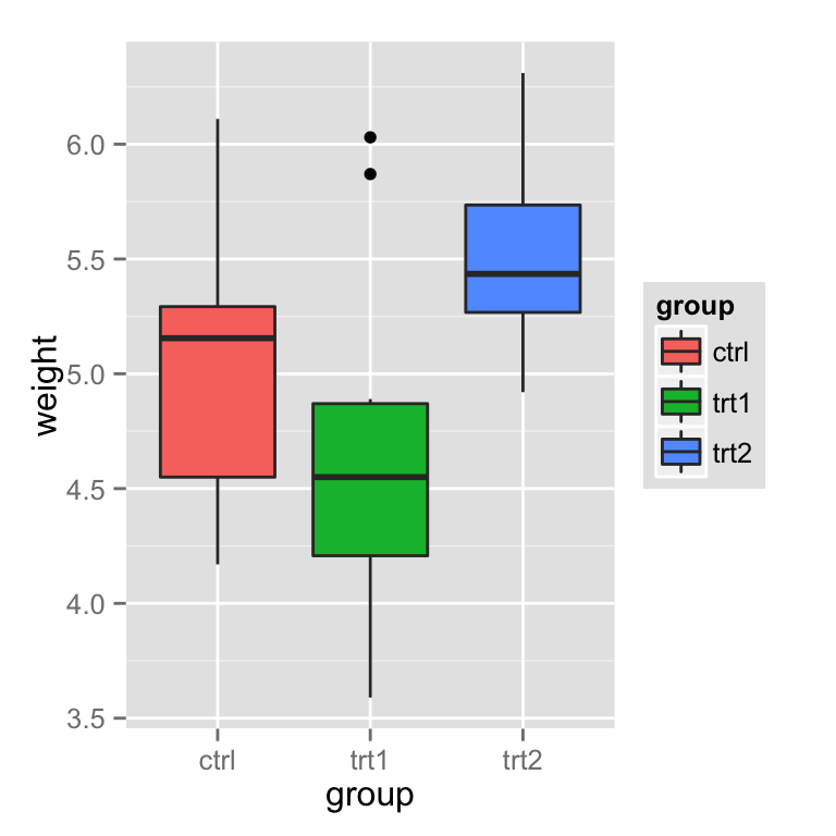
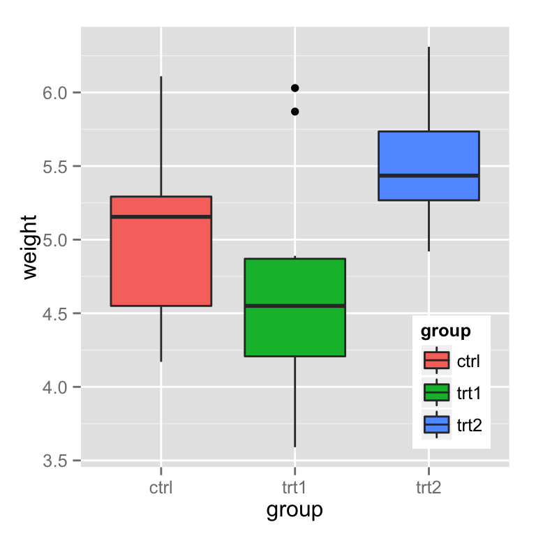
基本箱线图(带有图例)
library(ggplot2)
bp <- ggplot(data=PlantGrowth, aes(x=group, y=weight, fill=group)) + geom_boxplot()
bp
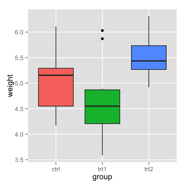
移除图例
Use guides(fill=FALSE), replacing fill with the desired aesthetic. 使用 guides(fill=FALSE) 移除由ase中 匹配的fill生成的图例, 也可以使用theme You can also remove all the legends in a graph, using theme.
bp + guides(fill=FALSE)
# 也可以这也
bp + scale_fill_discrete(guide=FALSE)
# 移除所有图例
bp + theme(legend.position="none")
修改图例的内容
改变图例的顺序为 trt1, ctrl, trt2:
bp + scale_fill_discrete(breaks=c("trt1","ctrl","trt2"))
根据不同的分类,可以使用 scale_fill_manual, scale_colour_hue,scale_colour_manual, scale_shape_discrete, scale_linetype_discrete 等等.
颠倒图例的顺序
# 多种方法
bp + guides(fill = guide_legend(reverse=TRUE))

# 也可以
bp + scale_fill_discrete(guide = guide_legend(reverse=TRUE))
# 还可以这也
bp + scale_fill_discrete(breaks = rev(levels(PlantGrowth$group)))
隐藏图例标题
# Remove title for fill legend
bp + guides(fill=guide_legend(title=NULL))

# Remove title for all legends
bp + theme(legend.title=element_blank())
修改图例中的标签
两种方法一种是直接修改标签, 另一种是修改data.frame
Using scales
图例可以根据 fill, colour, linetype, shape 等绘制, 我们以 fill 为例, scale_fill_xxx, xxx 表示处理数据的一种方法, 可以是 hue(对颜色的定量操作), continuous(连续型数据处理), discete(离散型数据处理)等等.
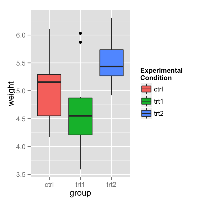
# 设置图例名称
bp + scale_fill_discrete(name="Experimental\nCondition")
# 设置图例的名称, 重新定义新的标签名称
bp + scale_fill_discrete(name="Experimental\nCondition",
                         breaks=c("ctrl", "trt1", "trt2"),
                         labels=c("Control", "Treatment 1", "Treatment 2"))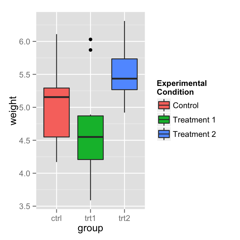
# 自定义fill的颜色
bp + scale_fill_manual(values=c("#999999", "#E69F00", "#56B4E9"),
                       name="Experimental\nCondition",
                       breaks=c("ctrl", "trt1", "trt2"),
                       labels=c("Control", "Treatment 1", "Treatment 2"))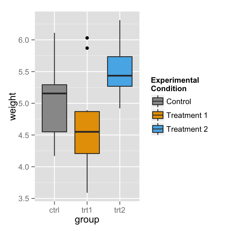
注意这里并不能修改 x轴 的标签,如果需要改变x轴的标签,可以参照http://blog.csdn.net/tanzuozhev/article/details/51107583
# A different data set
df1 <- data.frame(
    sex = factor(c("Female","Female","Male","Male")),
    time = factor(c("Lunch","Dinner","Lunch","Dinner"), levels=c("Lunch","Dinner")),
    total_bill = c(13.53, 16.81, 16.24, 17.42)
)

# A basic graph
lp <- ggplot(data=df1, aes(x=time, y=total_bill, group=sex, shape=sex)) + geom_line() + geom_point()
lp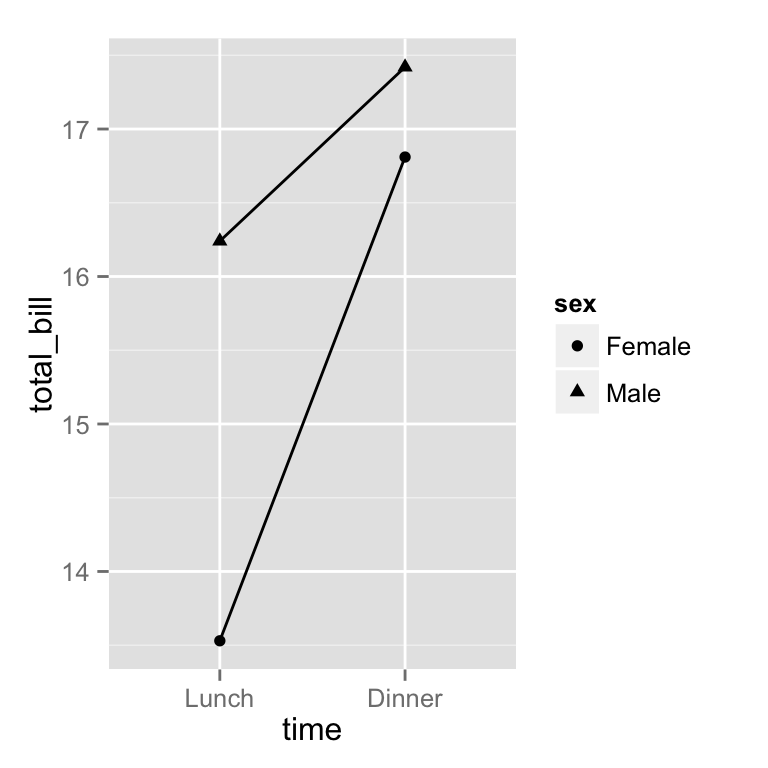
# 修改图例
lp + scale_shape_discrete(name  ="Payer",
                          breaks=c("Female", "Male"),
                          labels=c("Woman", "Man"))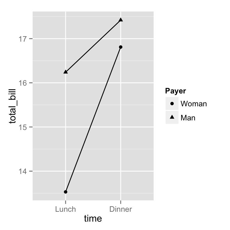
If you use both colour and shape, they both need to be given scale specifications. Otherwise there will be two two separate legends. 如果同时使用 color和shape,那么必须都进行scale_xx_xxx的定义,否则color和shape的图例就会合并到一起, 如果 scale_xx_xxx 中的name相同,那么他们也会合并到一起.
# Specify colour and shape
lp1 <- ggplot(data=df1, aes(x=time, y=total_bill, group=sex, shape=sex, colour=sex)) + geom_line() + geom_point()
lp1
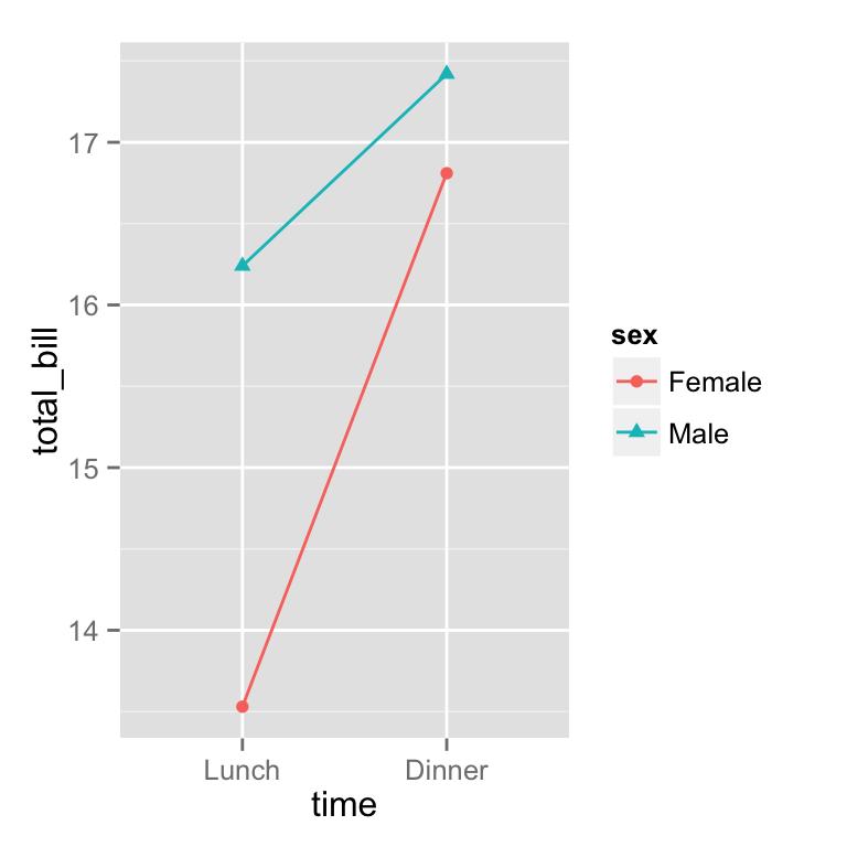
# Here's what happens if you just specify colour
lp1 + scale_colour_discrete(name  ="Payer",
                            breaks=c("Female", "Male"),
                            labels=c("Woman", "Man"))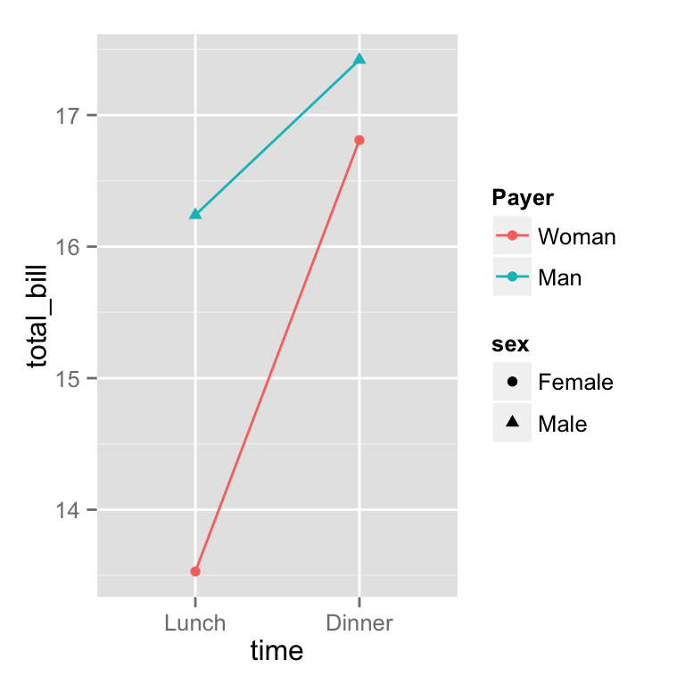
# Specify both colour and shape
lp1 + scale_colour_discrete(name  ="Payer",
                            breaks=c("Female", "Male"),
                            labels=c("Woman", "Man")) +
      scale_shape_discrete(name  ="Payer",
                           breaks=c("Female", "Male"),
                           labels=c("Woman", "Man"))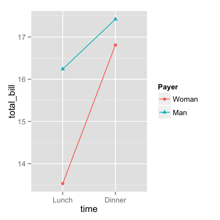
### scale的种类
scale_xxx_yyy:
xxx 的分类 colour: 点 线 或者其他图形的框线颜色 fill: 填充颜色 linetype :线型, 实线 虚线 点线 shape: 点的性状,超级多,可以自己搜索一下 size: 点的大小 alpha: 透明度
yyy 的分离 hue: 设置色调范围(h)、饱和度(c)和亮度(l)获取颜色 manual: 手动设置 gradient: 颜色梯度 grey: 设置灰度值discrete: 离散数据 (e.g., colors, point shapes, line types, point sizes) continuous 连续行数据 (e.g., alpha, colors, point sizes)
修改data.frame的factor
pg <- PlantGrowth    # Copy data into new data frame
# Rename the column and the values in the factor
levels(pg$group)[levels(pg$group)=="ctrl"] <- "Control"
levels(pg$group)[levels(pg$group)=="trt1"] <- "Treatment 1"
levels(pg$group)[levels(pg$group)=="trt2"] <- "Treatment 2"
names(pg)[names(pg)=="group"]  <- "Experimental Condition"

# View a few rows from the end product
head(pg)
##   weight Experimental Condition
## 1   4.17                Control
## 2   5.58                Control
## 3   5.18                Control
## 4   6.11                Control
## 5   4.50                Control
## 6   4.61                Control
# Make the plot
ggplot(data=pg, aes(x=`Experimental Condition`, y=weight, fill=`Experimental Condition`)) +
    geom_boxplot()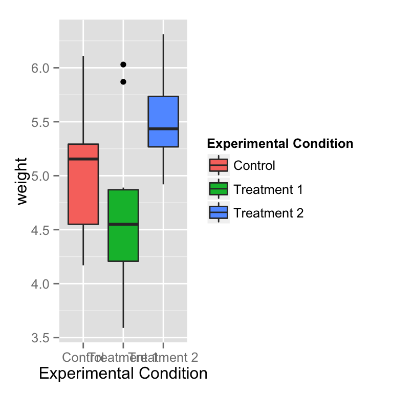
修改标题和标签的显示
# 标题
bp + theme(legend.title = element_text(colour="blue", size=16, face="bold"))

# 标签
bp + theme(legend.text = element_text(colour="blue", size = 16, face = "bold"))
修改图例的框架
bp + theme(legend.background = element_rect())
bp + theme(legend.background = element_rect(fill="gray90", size=.5, linetype="dotted"))
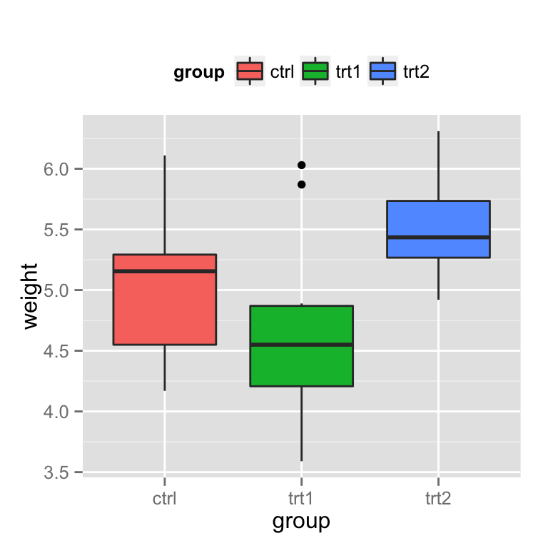
设置图例的位置
图例的位置(left/right/top/bottom):
bp + theme(legend.position="top")
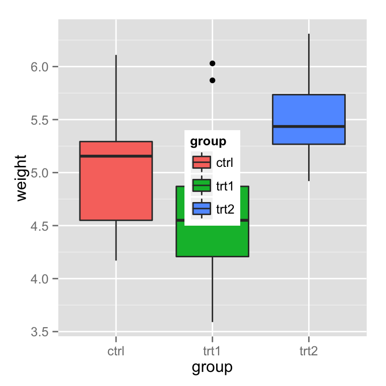
也可以根据坐标来设置图例的位置, 左下角为 (0,0), 右上角为(1,1)
# Position legend in graph, where x,y is 0,0 (bottom left) to 1,1 (top right)
bp + theme(legend.position=c(.5, .5))
# Set the "anchoring point" of the legend (bottom-left is 0,0; top-right is 1,1)
# Put bottom-left corner of legend box in bottom-left corner of graph
bp + theme(legend.justification=c(0,0), # 这个参数设置很关键
           legend.position=c(0,0))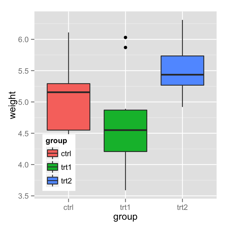
# Put bottom-right corner of legend box in bottom-right corner of graph
bp + theme(legend.justification=c(1,0), legend.position=c(1,0))
隐藏斜线
# No outline
ggplot(data=PlantGrowth, aes(x=group, fill=group)) +
    geom_bar()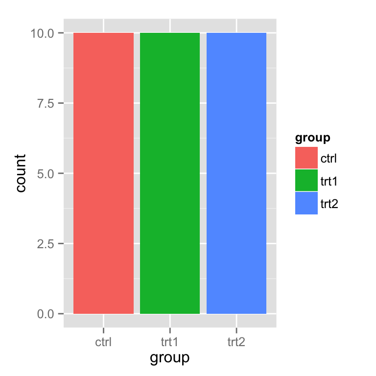
# 如果设置了颜色, 那么图例中就会出现 黑色斜线
ggplot(data=PlantGrowth, aes(x=group, fill=group)) +
    geom_bar(colour="black")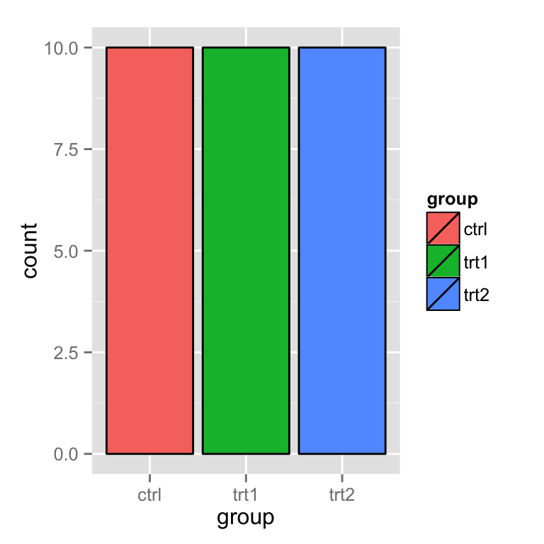
# 黑魔法: 可以先设置geom_bar, 然后再来一个没有 图例 的 geom_bar
ggplot(data=PlantGrowth, aes(x=group, fill=group)) +
    geom_bar() +
    geom_bar(colour="black", show_guide=FALSE)
总结
到此这篇关于R语言ggplot2设置图例(legend)的文章就介绍到这了,更多相关R语言ggplot2图例内容请搜索好代码网以前的文章或继续浏览下面的相关文章希望大家以后多多支持好代码网!